
Showing posts with label Brief 5 - Echowire. Show all posts
Showing posts with label Brief 5 - Echowire. Show all posts
Tuesday, 29 May 2012
Saturday, 19 May 2012


Tuesday, 15 May 2012
EchoWire Development..
 Using the colours of which the guys pointed out as their favourites I want to make a series of designs fro products of which will be used for events. Therefore the E logo will be the consistent and I need to create a design of which people recognise as Echowire, especially on the poster designs.

 They want to use the different stickers to apply to the vinyls as they record onto vinyl. I think these will look really cool as a set and will promote the company.


Sunday, 13 May 2012
More research for EchoWire..
 I want to create a series of different designs of the Echowire vinyls, all of which work together and look from the same record label, yet are still different.
I also want to use the colours from the logo designs, then apply these colours to the posters and other promotional material they may want.


I also want to use the colours from the logo designs, then apply these colours to the posters and other promotional material they may want.


Tuesday, 8 May 2012
Mock up of idea..
 I want the packaging to be in full colour of the range of different colours in the logo ideas.
I also want to include a poster in the packaging of which relates to which ever event the colour is representing. It could possibly be monthly events and a colour for each and event for each.
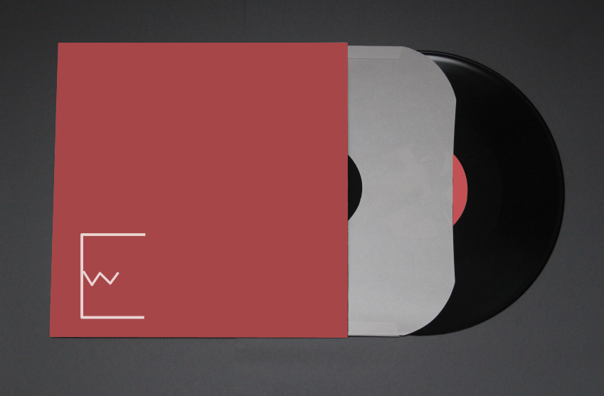
I also want to include a poster in the packaging of which relates to which ever event the colour is representing. It could possibly be monthly events and a colour for each and event for each.


Sunday, 25 March 2012
Saturday, 24 March 2012

Development of the logo..
 I did like this design and I think it was due to the link between the E and the W. So I therefore wanted to develop this logo.
 YES! I really like this idea! I really like having the W inside the E as then it doesn't read 'EW' I also think it gives the logo a longer and shorter version of the logo just by keeping it simple!
I hope they like this design!!


I hope they like this design!!


Thursday, 22 March 2012


Wednesday, 21 March 2012
EchoWire - Digital ideas..
I wanted to create variations of ideas for the team to chose from of which I could then develop.


On the other hand I am not sure if they will like the minimalist sharp look, also it does read 'EW'


Subscribe to:
Posts (Atom)