Tuesday 31 January 2012


http://type-truck.com/the-truck/


It was originally a fleet truck for American Linens, and their logo is still faintly visible beneath the white body paint. I bought it from a very kind man in Washington who was mid way through an RV conversion. He had installed a shower, toilet, stove, fridge, water heater, a massive propane tank, and convertible sleeping bench. It was a shame to rip out all his hard work, but I wanted to customize the interior to work for this project. As nice as it would be to have all those amenities onboard, I needed the space to function as a printshop, with adequate work and storage space. And so, one sunny day in April, my brother and I tore everything out. Floors, walls, ceiling, ratty insulation… everything down to the metal skeleton. In retrospect, this is something we should have done *much* earlier but, you know, I’d never torn up a truck before. I think I was also struggling with some anxiety about the whole thing, feeling like I was in over my head and just didn’t know where to begin. Turns out that diving right into demolition work and spending some time working under the truck is an incredibly empowering experience, and was just what I needed to feel like maybe, just maybe, this was something I could actually pull off.


Design Context Book - 
Within my book I want to focus in on my statement of intent: Concept driven promotional designs utilising type, layout and photography.

Through the book I want to focus overall on promotion and how all: type, identity and fashion use promotion and designs within these sectors for promotion.

Looking at the different designers and how they have used different ways of promotion.

Interviewing the designers about the ways in which they use type, identities and designs for fashion.
Founded
- Graphic Design Company in Newcastle whom do a lot of work for The Baltic and promotion


Source - 
http://source.diftype.com/
A fashion blog which includes various different variations and inspiration relating to fashion.


September Industry -
Graphic design for fashion


I really like how the designs are fairly simplistic and work yet are interesting and you want to look and read more about them/find out what they are about.
Tsto - 
Created a free magazine published 6 times a year distributed around Helsinki, all promoting the design within Helsinki.


Tsto -
A graphic design company in Finland, creating the graphics and promotion for Flow Festival last year. 


Morey Talmor
- A graphic designer orinigally from Israel now working in New York.

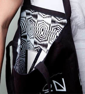
I love the range of products he has made for the one brief. He has used the design idea to promote the museum then applied it to multiple products which promotes the museum. This is the kind of thing I want to do both within my first brief and also within the fashion book brief.


I really like the use of type with a pattern I think although quite simple is really effective to catch your eye and attract you to it.


Monday 30 January 2012

Meeting with the other fashion group..

As our meeting with Susan is on Friday we discussed what we needed to have for then which is:

Layout Ideas
Concept and Idea for the book
How they would link/work together

We discussed about researching more into the course and the specialities the students have within the course.

Also decided to go away individually and by wednesday at 1 have different visuals and ideas for how the books will link together with the idea/theme of: Moving forward and the future.

Then on wednesday we can all bring in our ideas into the group and show eachother the ideas which for friday can be developed and merged together to create a strong visual idea of which we can pitch to Susan and work with Susan to promote the course.
Layout Ideas for the yearbook - making the layout flexible to include many different styles of designers within fashion.


Layout Ideas for the fashion yearbook..
It needs to be flexible and diverse enough to hold multiple different shapes and also to include different amounts of text.
First meeting with Susan
27.01.12

When discussing about the books Susan wants two seperate books of which work nicely together, yet the design does not need to be the same (down to us).

Does not want it to be stereotypically 'fashion' its not just about material and machinery.

Susan leaves on the 12th March - then we work with Gemma the first year tutor.

Deadline: Graduate Fashion Show 4th June - Ultimate deadline 6th. But would like them to be printed by this week.

Within the book she would possibly like there to be not only the finished photographs but also the drawings and ideas behind this.

Want it to be optimistic & positive rather than a record of what they have done - look to the future.

We have been given Group B: Fashion & Design around 40 people in the group.

-If someone misses a deadline that is it they aren't in the book.
-We will receive the list of names/info/and any other written info: 27.02.12

Next meeting: 03.02.12 and show layout designs and concepts/ideas for the book

Friday 27 January 2012

Playing around with logo ideas..

I do really like the word cubed as it fits the concept perfectly, however I havnt as yet found the way I want to use the name and this font together for the logo
(ADD SHEETS)

Digitalising the font..

I want the font to be ultra modern, square sans serif to convey the idea of 3D and cubed alongwith making it a new inventions and looking at the font makes it look modern and a new fresh brand.

Out of these fonts I like the Squarehead (bottom left) however I think the D looks like an O so therefore I want to edit this.


Out of these ideas on the left I think they work much better than the initial font as it does like an O.

However I quite like the bottom design of the logo, ad it is the smallest of differences yet does change the letter from a O to a D
Promotion for an event/exhibition

 Promotion can take many different forms and I think this is why I want to be in promotion I don't particularly focus on what I am going to make it is more about how and why I would do it that way. And I tend to use type on all of my designs and not so much image.

Brief 1 - Visual Ideas:

I think using video it would be really cool to use this sort of effect and put the video within the text!

Then I can have a different thing running in the background to that of which it in the text - Ill have to test it out but I think it will be a really effective idea.
 Promotion for events/exhibitions

This is the kind of stuff I want to do, I would like to work with and create strong concepts and promote. However not only for exhibitions or events but this is a big interest.

 Promotion for events/exhibitions

This was an exhibition in 2011 and print collatoral for The Other Hemisphere, an exhibition showing at Ventura Lambrate in Milan.

I would really like to do this kind of stuff in making print collatoral to promote and then also to be able to take that across to web.


Promotion for events/exhibitions

 These prints were designed to bring 5 aspects of the Victorian College of Art together (arts, performing arts, music, film and television)
I would like to promote events across a range of different medias, as to not focus myself down too much as some events/projects will be better promoted in a different way to the last.

Promotional work for exhibitions/events

This work was for Object's Gallery's Annual Manual: A guide to design happening in Australia now.
This work was curated by the Office for Good Design.