Talking with Andy Lodge..
Talking with Andy Lodge about video and photography he showed me this video.
I really like the composition and combination of both photography and video. Also each section of the video was recorded on a canon 5D camera, I really like the way that for each section of video they film it from several different angles.
This would be quite a good idea to apply to the section of my video where they walk down the street and close ups of clothes.
Monday 30 April 2012


Sunday 29 April 2012


So I heard from marketing that they want a design for a leaderboard for Creative Review.
All the leaderboards on Creative Review are gif files and flick through different information that needs to be shown.
Therefore for the web leaderboard for the end of year show I need to show/say:

- Date and Time
- Photographs
So now I need to think about how I am going to display the information.


Invitation development..
For the invitations I have to create designs of which may be more expensive and ones that are cheaper depending on the budget left for them..
 I could create something with the photograph on the front, however I don't really want a lot of text on the front.


 This could be quite a good idea to just keep the front of the invite clean and simple, then leave most the information for the back.
 I'm not sure I really like this layout, this would work better if there was more text for the front of the invite.
 This design is quite nice and reads in the right way. The title then a private invite then where it is.

 I quite like the layout of this with the 'private invitation' on the top of the Revealed. However I am not sure about the leeds college of art logo at the bottom.
 This is a very simple layout for the back of the invitation, however I am not sure if it is maybe too simple?
 I do like this one a lot for the back of the invite. This would be a very effective back of the invite and cost effective.
For the invitations I have to create designs of which may be more expensive and ones that are cheaper depending on the budget left for them..


Saturday 28 April 2012


Design Context Publication -
Photography


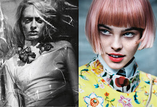

Photography

Photography: Sarah Piantadosi, Fashion Editor: Ellie May Brown, Make Up Alex Byrne using MAC Pro
Hair: Tomihiro Kono using Bumble and Bumble. Nails: Mai Kodama using Topshop
Photography Assistant: Amie Norris. Hair Assistant: Nozomi Yamamoto
Hair: Tomihiro Kono using Bumble and Bumble. Nails: Mai Kodama using Topshop
Photography Assistant: Amie Norris. Hair Assistant: Nozomi Yamamoto
Digital: Three Four Digital
Models: Idina at Select Jade at Models 1 Jess H at Next


Concept for DC Publication -
I am going to create the publication along the lines of my branding, and play on the idea of double sided.
Look at graphic design for fashion on one side and fashion/documentary photography on the other. The under lying theme will be minimalism as this is the style of my work.
I am going to create the publication along the lines of my branding, and play on the idea of double sided.
Look at graphic design for fashion on one side and fashion/documentary photography on the other. The under lying theme will be minimalism as this is the style of my work.
Design Context Publication -
Photography

Photography

Describe your work in two sentences.
I photograph people I feel close to.
I photograph people I feel close to.
Would you consider your work documentary or art?
I don’t really put my work in one of the corners… I think it depends on the place where it’s shown. If it’s shown in a museum, it may be received as art, though the work didn’t change at all. If it’s in a magazine it might be called documentary.
I don’t really put my work in one of the corners… I think it depends on the place where it’s shown. If it’s shown in a museum, it may be received as art, though the work didn’t change at all. If it’s in a magazine it might be called documentary.
Do you consider your work diaristic or is there an element of staging?
I try to be as diaristic as possible, but with photography there is always an element of staging I guess, there are loads of texts about this question but I use cameras that are as small as possible so that they don’t become a strong element in the interaction with people.
I try to be as diaristic as possible, but with photography there is always an element of staging I guess, there are loads of texts about this question but I use cameras that are as small as possible so that they don’t become a strong element in the interaction with people.
You’ve created works about incredibly personal subjects such as Gosia. Do you have a close relationship with all your subjects?
Yes, I try to. I think that you can tell more about a person, photographically as well, when you spend a lot of time with them. I trust a portrait series much more than single portraits, as you are able to see the subject in many different situations / from different sides instead of judging it from the look, its clothes and the background of one image. The more images of someone you know, the harder it is to box them inside a stereotype.
Yes, I try to. I think that you can tell more about a person, photographically as well, when you spend a lot of time with them. I trust a portrait series much more than single portraits, as you are able to see the subject in many different situations / from different sides instead of judging it from the look, its clothes and the background of one image. The more images of someone you know, the harder it is to box them inside a stereotype.
There seems to be an element of pathos as well as humour in some of your work. Do you see them as interlinked?
There are moments in everyday life that are incredible but that you don’t have the time to recognize or even perceive right away. Photography helps in that respect. When I’m alone, putting together a series, I seem to choose pictures that look more grave than the situation maybe was. The humourous side comes from my personality maybe, how I interact with people. I’m not sure really. I sound like a dick here.
There are moments in everyday life that are incredible but that you don’t have the time to recognize or even perceive right away. Photography helps in that respect. When I’m alone, putting together a series, I seem to choose pictures that look more grave than the situation maybe was. The humourous side comes from my personality maybe, how I interact with people. I’m not sure really. I sound like a dick here.
What do you find exciting about self-publishing?
That the works or stories told don’t have to live up to any commercial standard. You don’t need a middle man / publisher that has to think about numbers/business, judging the work.
That the works or stories told don’t have to live up to any commercial standard. You don’t need a middle man / publisher that has to think about numbers/business, judging the work.
Where’s best, Linz or Paris?
It’s hard to compare the two cities as they are so different in size. And I lived much longer in Linz so I know more people there and that makes living a lot nicer. But Ii think generally it’s good if the city you’re living in has a kind of artistic vacuum, that there is a lack of something, that you are able to fill. In Paris every brick has a history, everything spills over with cliché. I don’t really feel able to contribute to that.
It’s hard to compare the two cities as they are so different in size. And I lived much longer in Linz so I know more people there and that makes living a lot nicer. But Ii think generally it’s good if the city you’re living in has a kind of artistic vacuum, that there is a lack of something, that you are able to fill. In Paris every brick has a history, everything spills over with cliché. I don’t really feel able to contribute to that.
http://usedmagazine.co.uk/?p=786
Design Context -
Promotion

Promotion

An in-depth examination of the Paul Smith brand vividly illustrates the creative scope of the invitation, for example. Regarded by the industry as a quintessentially British brand, the label's 20-year relationship with Aboud Creative has produced a diverse range of invitations tailored to suit individual collections. The primary colours and geometric shapes used for one season form a dramatic contrast to a handwritten invite emblazoned with delicate floral motifs designed for another.
Paolo Bazzani's work for Kenzo fashion shows also reveals how an invitation can become a work of art in itself. For the Spring/Summer 09 event, Bazzani used children's pop-up books as inspiration, to create a whimsical 3D collage of paper butterflies, which of course also doubled up as an invite.


I could fold over the corner of the flat invite then scan it back in and print it like this so even though it is flat it doesn't look it.
Also information could be written in the corner and have the image on the front so they fold is covering the face of the picture.

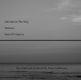
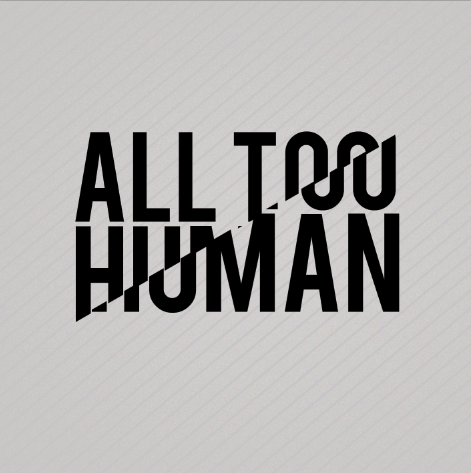
More designs for All Too Human..
This idea is a completely new idea to send to Tony as another option. I changed the photography to black and white so that it gave the designs more or an atmosphere. I think they look pretty sweet however I think this can be pushed further. I could maybe make a duotone image and overlay type for the CD packaging, then this gives me more colour to play with?
 Sans serif or serif? I am unsure however Ill send both to Tony to see which he prefers if he even wants to go with this design. However personally I think sans.


Sans serif or serif? I am unsure however Ill send both to Tony to see which he prefers if he even wants to go with this design. However personally I think sans.


He asked for something simplistic yet interesting and a bit different. Therefore this is what I want to do. I want it to be simple on the outside but have something on the inside which interests people and they are won over by.
It may be a pattern or design around the style of music it is..


I do think keeping it bold and interesting yet simple which I think will work well. But this still needs development.
Subscribe to:
Posts (Atom)